
Appearance
Settings → Appearance (administrators) makes the panel look and read like your own product. You can rename it, give it a logo, choose colours and a font, switch between light and dark, change the sign-in page, add links to the sidebar and show an announcement. Nothing needs a restart or a rebuild, and until you change something the panel looks exactly as before.
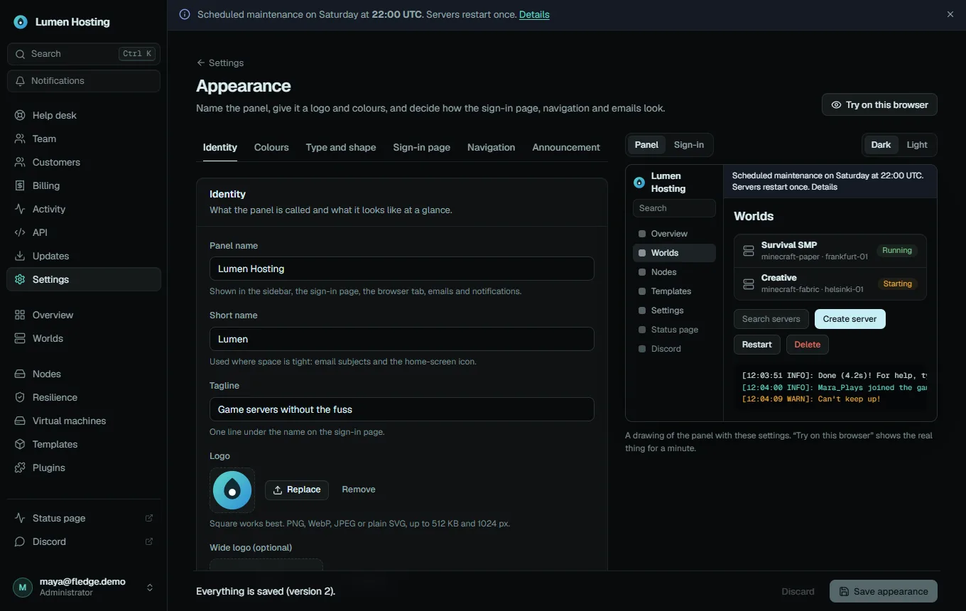
The editor has a live preview on the right. It is a small drawing of the panel made with your draft settings, in dark or light, and as the panel or as the sign-in page. Nothing is public until you press Save appearance.
| Tab | What it controls |
|---|---|
| Identity | Panel name, logo, tab icon, email sender and footer, source link |
| Colours | Presets, light or dark, the accent and tint, readability checks |
| Type and shape | Font, text size, corner radius, density, motion |
| Sign-in page | Welcome text, layout, background, links |
| Navigation | Renamed pages and extra sidebar links |
| Announcement | A banner for everyone, customers or administrators |
| Advanced | Custom CSS, theme files, earlier versions, reset |
Identity
| Setting | Notes |
|---|---|
| Panel name | 1 to 40 characters. Shown in the sidebar, the sign-in page, the browser tab, emails, notifications, the entry in authenticator apps and the passkey prompt |
| Short name | Up to 12 characters, for email subjects and the home-screen icon. Defaults to the panel name |
| Tagline | One line under the name on the sign-in page |
| Logo | PNG, WebP, JPEG or plain SVG, up to 512 KB and 1024 px. Square works best |
| Wide logo | Optional. Replaces the logo and the name in the sidebar and on the sign-in page. Up to 512 KB and 2048 × 512 px |
| Browser tab icon | Optional. PNG, ICO, SVG or WebP up to 128 KB. Defaults to the logo |
| Email sender name | The display name used when the From address under Settings → Email has none |
| Email footer | Up to 300 characters, added to the end of every email the panel sends |
| Source code address | Where the About dialog points. See what stays "Fledge" |
| Show "Powered by Fledge" | A small link under the sign-in form |
An uploaded image is stored in the panel's database and served from the panel's own address, so it needs no extra storage and is included in your database backups. Uploading only stores the file; it is used once you save. SVGs must be plain (shapes, paths and gradients): files with scripts, embedded styles, external references or a DOCTYPE are refused.
Colours
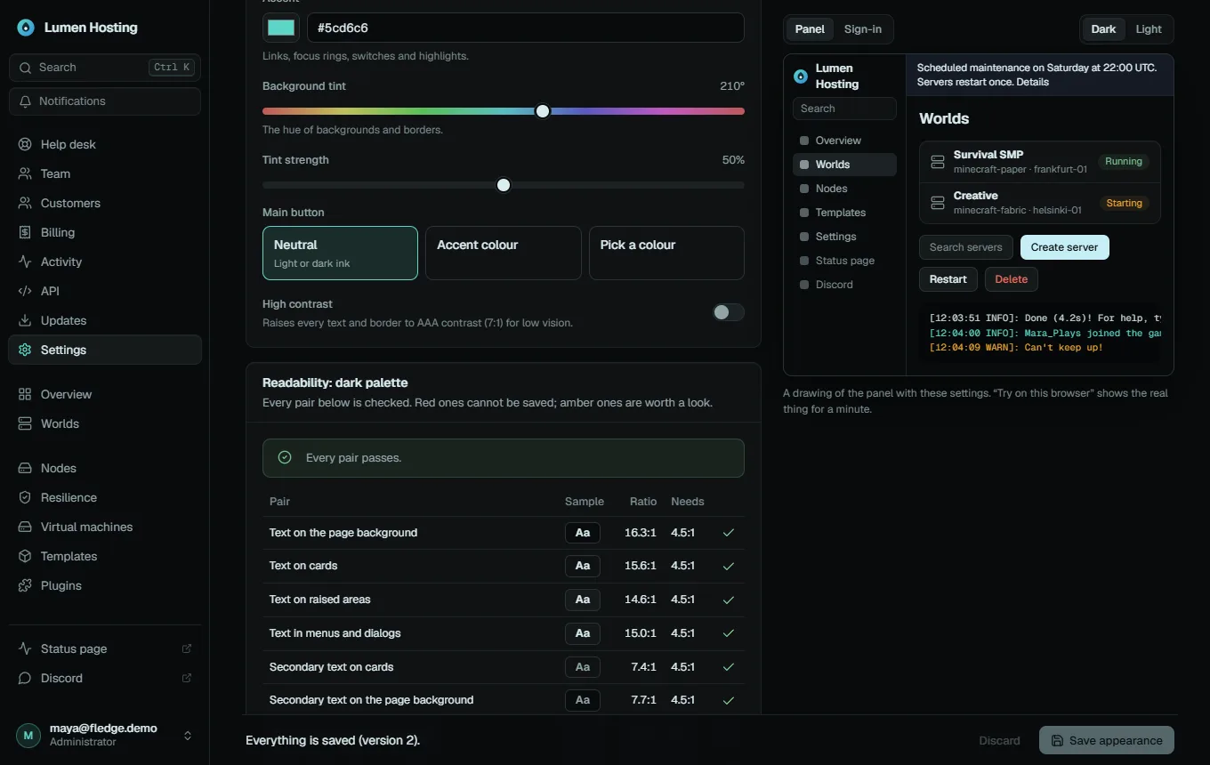
Starting point. Eight presets, each with a dark and a light version: Fledge, Midnight, Ember, Terminal, Paper, Snow, Violet and High contrast. A preset sets the colours, the font, the corner radius and the density; you can change any of them afterwards. The values are listed in Theme tokens and presets.
Light or dark. The default mode is what people see until they choose for themselves: dark, light or match the device. With People can choose for themselves on (the default), the account menu gets Light, Dark and Match this device, remembered in the browser and on the account. Turn it off to show one look to everyone.
Colours. Each of the dark and light palettes is described by a few inputs; Fledge calculates every other colour from them:
- Accent: links, focus rings, switches and highlights.
- Background tint and tint strength: the hue of backgrounds and borders; strength 0 is pure grey.
- Main button: neutral ink (the default), the accent colour, or a colour you pick.
- High contrast: raises every text and border to AAA (7:1) for low vision.
Readability is checked, not suggested. The Readability card lists every text and colour pair with its contrast ratio. An accent that would be too dim is moved (lighter on dark, darker on light) and the editor tells you. Colours you pin yourself under Pin individual colours can still fail, and then Save appearance stays off until they pass. The full list of checks is in Theme tokens and presets. The four status colours (success, warning, error, busy) are tuned to stay apart for people with red-green colour blindness, and you only get a warning if a pinned colour breaks that.
Type and shape
| Setting | Choices |
|---|---|
| Font | Geist (default), Inter, Atkinson Hyperlegible, the system font, or monospace. They are bundled with the panel; nothing is loaded from another site |
| Text size | 90%, 100%, 110%, 120% |
| Corner radius | Square, 4, 8, 10 (default), 14, 18 px |
| Density | Compact, comfortable (default), spacious: scales the height of buttons, inputs, menu items and table rows |
| Motion | Full, or reduced (transitions are nearly instant). A device that asks for reduced motion always wins |
Sign-in page
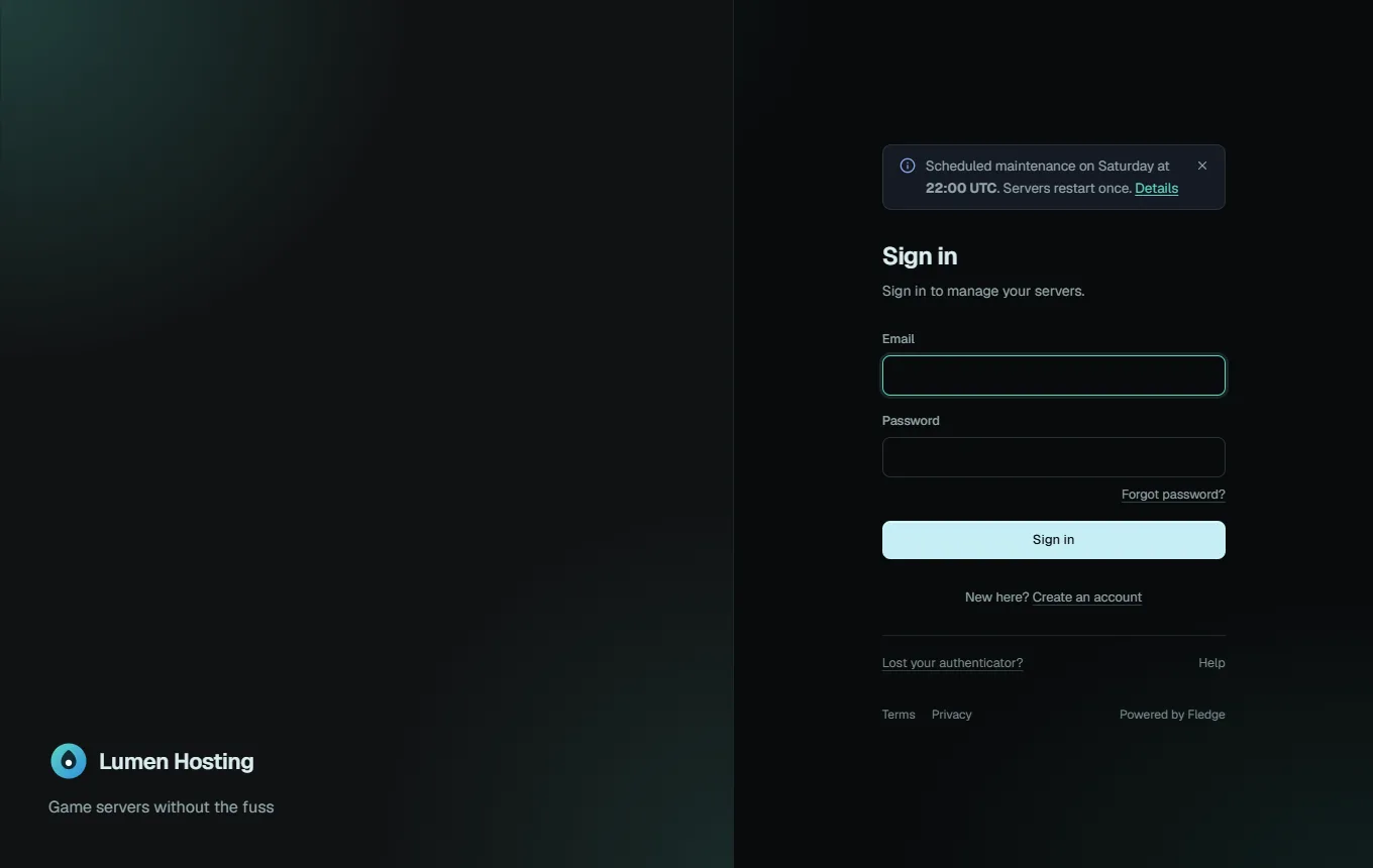
- Welcome text (280 characters, line breaks kept) shows under Sign in.
- Layout: Centred (one card in the middle) or Split (name and tagline on one side, the form on the other; one column on a phone).
- Background: plain, a soft glow from the accent colour, or a picture (JPEG, WebP or PNG up to 2 MB and 4096 px; a darkening gradient keeps the text readable).
- Links under the form: up to five (terms, privacy, a support address).
https,http,mailtoandtellinks are accepted.
An announcement set for everyone also appears on the sign-in page.
Navigation
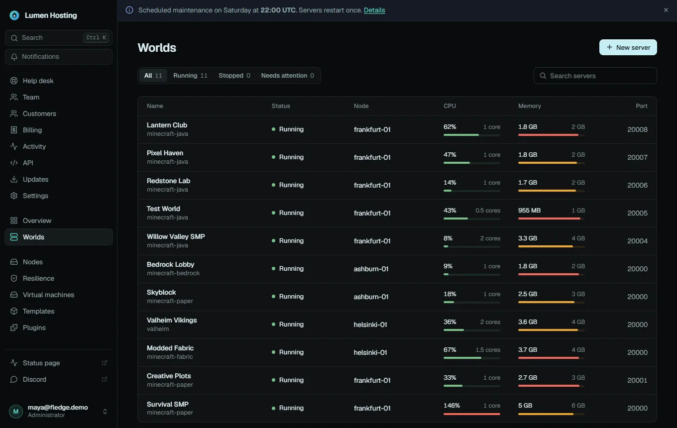
- Rename pages. Give any of the thirteen sidebar entries another word (including Store and Billing) (up to 24 characters), for example Servers → Worlds. The new word is used in the sidebar, the page title, the browser tab and the search. Other text in the panel keeps saying "server".
- Extra links (up to 8) appear at the bottom of the sidebar for everyone, for example a status page, the rules or a Discord invite. Each has a label, an address, an icon and an "open in a new tab" choice.
Announcement
A banner across the top of every page. Choose the tone (information, warning, problem), who sees it (everyone, customers or administrators) and optionally when it starts and ends. The text supports bold, code and links. If people may dismiss it, a dismissed message stays hidden until you change its text.
Advanced
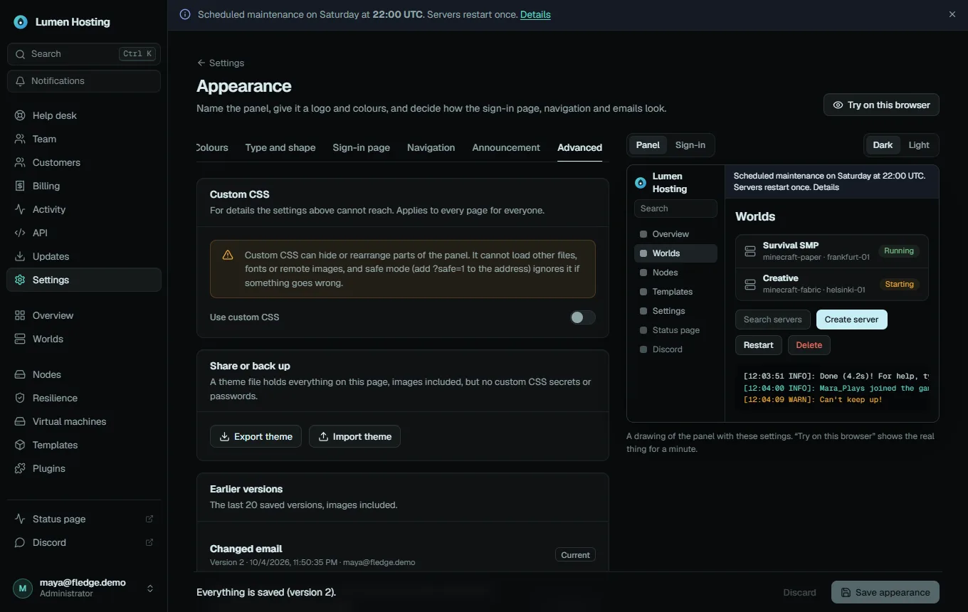
Custom CSS is off by default. When on, it is added after the panel's own styles for everyone. It is checked every time it is saved and every time it is served:
- no
@import,@namespaceor@font-face; url()may only point to#fragments, the images/branding/mark,/branding/wordmarkand/branding/login, or small embedded images (data:URLs up to 20 KB);- no
image-set(),expression(),behavior,-moz-binding, HTML tags or invisible characters; - at most 32 KB, with balanced braces.
Because it cannot load anything from another server, CSS cannot send data out. It can still hide or rearrange parts of the panel, so keep safe mode in mind. The colour variables are named in Theme tokens and presets.
Share or back up. Export theme downloads a fledge-theme JSON file with everything on these tabs and the images. Import theme loads such a file into the editor (it runs the same checks) and shows what it changes; nothing is saved until you press Save appearance.
Earlier versions. The last 20 saved versions are kept with who saved them and what changed, images included. Restore makes an old version the newest one, so nothing is lost. Reset to the Fledge look does the same with the built-in defaults.
Try before you keep it
Try on this browser shows the draft on the real panel, in this browser only. A bar at the top says so and counts down 60 seconds; unless you choose Keep previewing, the panel goes back to the saved look on its own. That way a theme that makes the page hard to read cannot trap you: the bar is drawn in the system's own colours so it stays readable. Leaving the page ends the preview too.
If two administrators edit at once, the second save is refused with "Someone else saved a change" and offers to load their version, so nobody overwrites the other silently.
Each person's choice
Everyone (customers too) can choose Light, Dark or Match this device from the account menu, unless you turned that off. The choice is kept in the browser and on the account, so it follows the person to other devices.
Where the name appears
| Place | Uses |
|---|---|
| Sidebar, sign-in page, loading screen, install help page | Name and logo (or wide logo) |
| Browser tab title and icon, home-screen name and icon, address bar colour | Name, short name, icon |
| Invitation, reset, test and notification emails | Name in the subject and text, short name in [brackets], sender name, footer |
| Discord, Slack and webhook notifications | Name before the message |
| Authenticator apps and passkeys | Name as issuer and relying-party name (existing entries keep working) |
What stays "Fledge"
The panel name is for your users. These keep naming the software, because that is what they are about:
- the About dialog in the account menu, which always shows the product name and version, the licence (AGPL-3.0) and a link to the source code. It cannot be switched off;
- the Updates page and release notes, plugin compatibility messages and this documentation;
- the optional "Powered by Fledge" link on the sign-in page.
Fledge is free software under the AGPL-3.0. Renaming and restyling are fine; if you also change the code and let others use the panel, the licence asks you to offer them your source. Put its address in Source code address and the About dialog will point there.
Permissions
Only administrators with a signed-in browser session can change the appearance. API tokens cannot, and customers can only read the public document (name, colours, logo) that every page needs. Every change is recorded in the audit log (branding.update, branding.asset.upload, branding.restore, branding.reset). Endpoints are listed under Appearance in the API reference.
Something wrong with a theme? See Recovering from a bad theme.